A Little Summary
Skills
Market and User Research
User Testing
UI/UX Design
Product Design
Marketing Strategy
Timeline
May – Aug '20
Research & Prototype
Sept – Dec '21
UI & Visual Design
Tools
Figma
Sketch
Google Forms
Tencent Forms
Brief
UBI is a travel companion service that helps travelers discover, record, and create shared memories when they are on a trip.
UBI provides features including reliable point of interest discovery based on real user feedback and trip data, real-time and customizable traveling records, shared trips with friends, and easy memory sorting and storing. All these features allow travelers to enjoy a further elevated traveling planning, recording, and memory-storing experience without sacrificing the enjoyment they get in the traditional traveling process.
Background
With the development of a more convenient transportation system, people are more willing to leave their surroundings and explore the world. The US domestic leisure trip data has been growing steadily since 2010, from 1.5 billion trips to nearly 2 billion in 2019. This data showed the traveling industry's growth prior to the COVID-19 pandemic while also laid a foundation of how the whole industry may thrive back after the pandemic globally. The accompanying problems also emerge as more and more people rely on their smart devices to help them research, plan, record, and share their journey.
Finding the Problem
In order to understand what the users need when traveling, I conducted quantitative survey using Google Forms and Tencent Forms to collect some preliminary and general thoughts about the traveling experience from a wide range of people. The research finally collected more than 400 responses. I also interview 3 users with different habits, intentions, and characteristics when they are traveling.
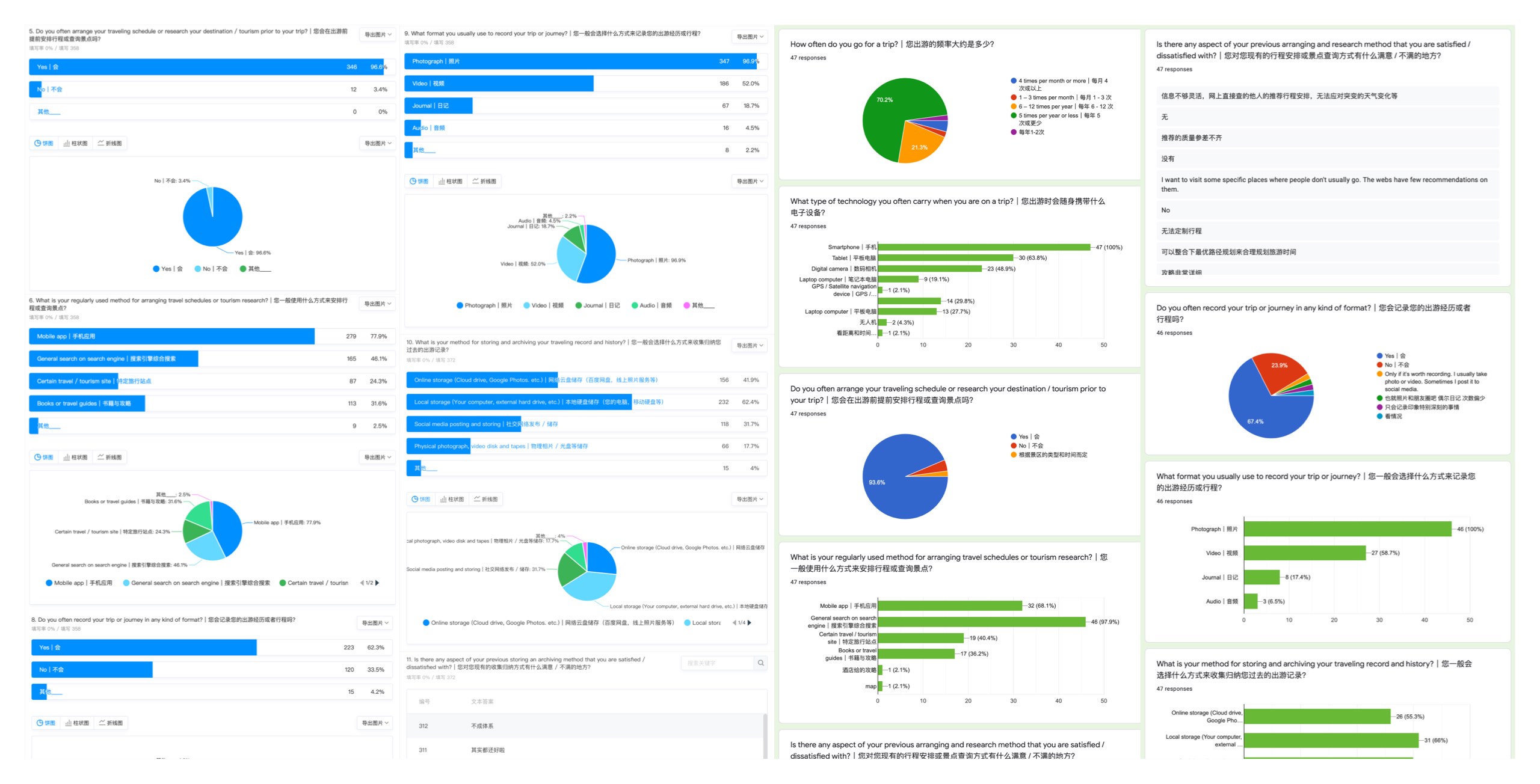
Some of the form data and questions
Improving Points
Finally, I refined all the collected insights from qualitative and quantitative research into the following four points: reliability, discoverability, recording, and sharing.
Reliability
"There are lots of paid recommendations and promotional content in the apps."
Discoverability
"It’s hard to find not-commercialized yet beautiful spots on today's platforms."
Recording
"Texts, photos and videos are all recorded in different apps."
Sharing
"It’s hard to share my photos or memories with a friend who is also on the trip."
The Vision
How might we improve the user’s current experience of discovering, recording, and memorizing their journey with friends?
Understand the Users
Before settling on an exact solution, I also wanted to dive deeper into the user's current experience on similar services and figure out what unique feature my solution can bring to the existing market. I defined the persona and user scenarios which helped me imagine being the user on the journey.
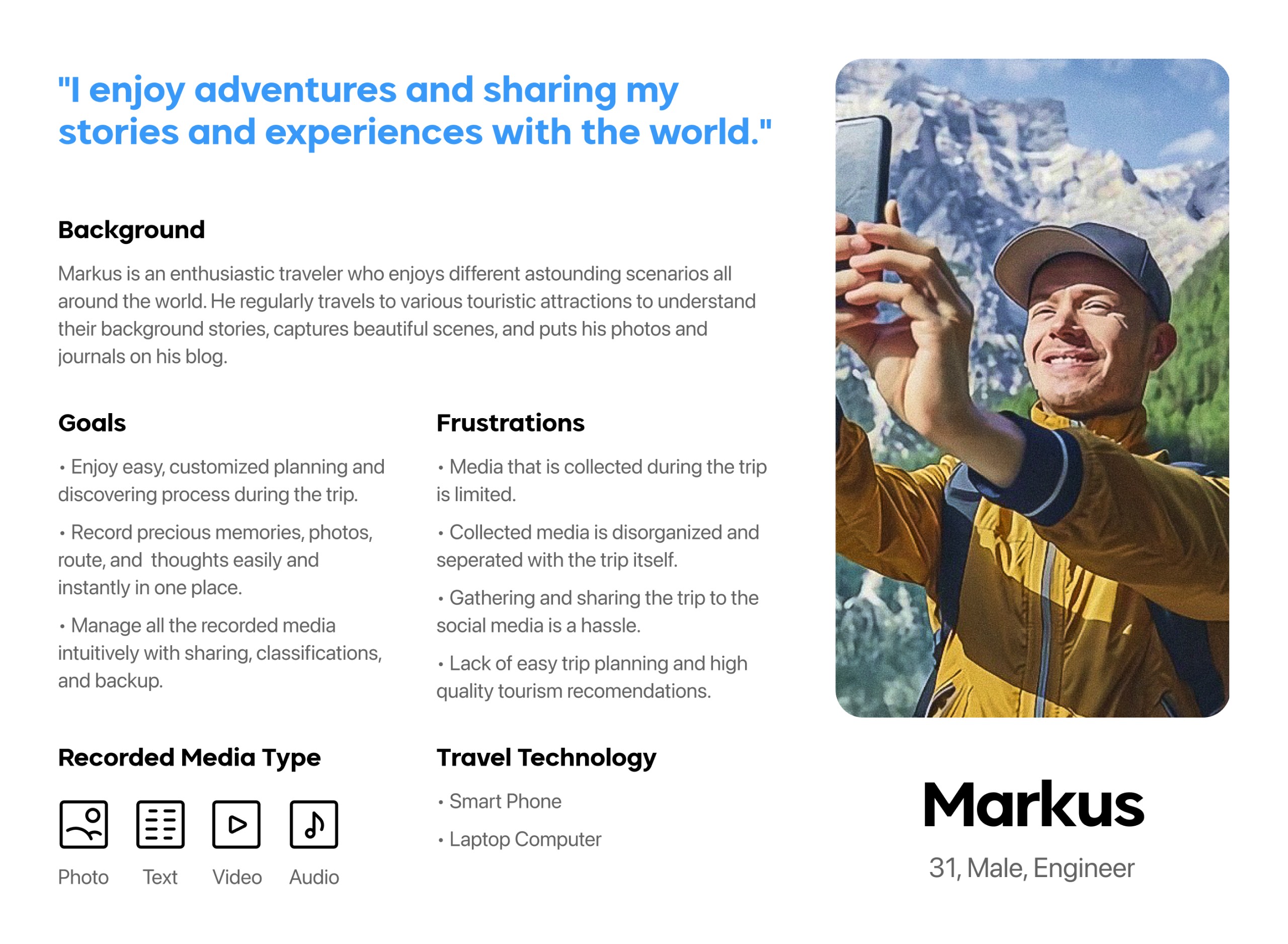
Persona
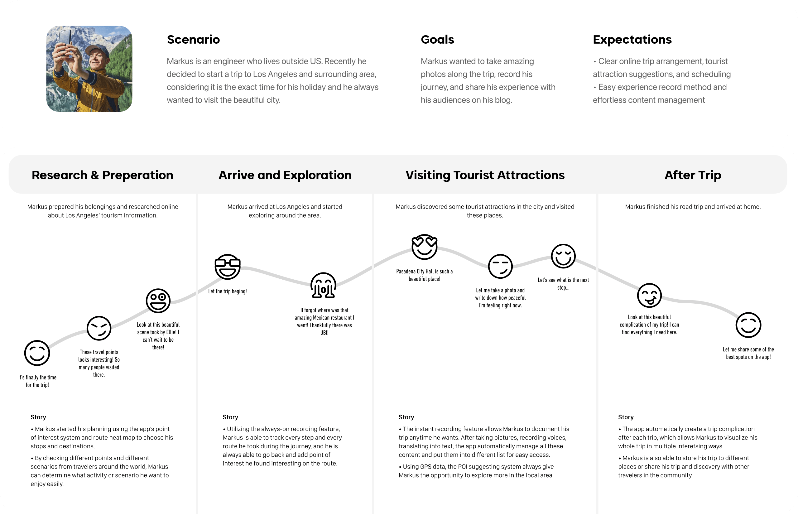
With all the previous users' needs and insights in mind, I started to think about how a fictional user can fit into the anticipated user flow and features the service provides. Therefore the primary persona of the service, Markus, is created. He is one of the best representations of our primary user group. As a traveler/blogger, his emotions and frustration help us identify where we should improve and how his journey can be optimized throughout the trip.
User Scenario
Before UBI
Based on the personas, I imagined how the users would interact with different product features, including planning, recording, managing, and sharing throughout the trip. I also try to visualize their emotions for further analysis and design by creating different user journeys.
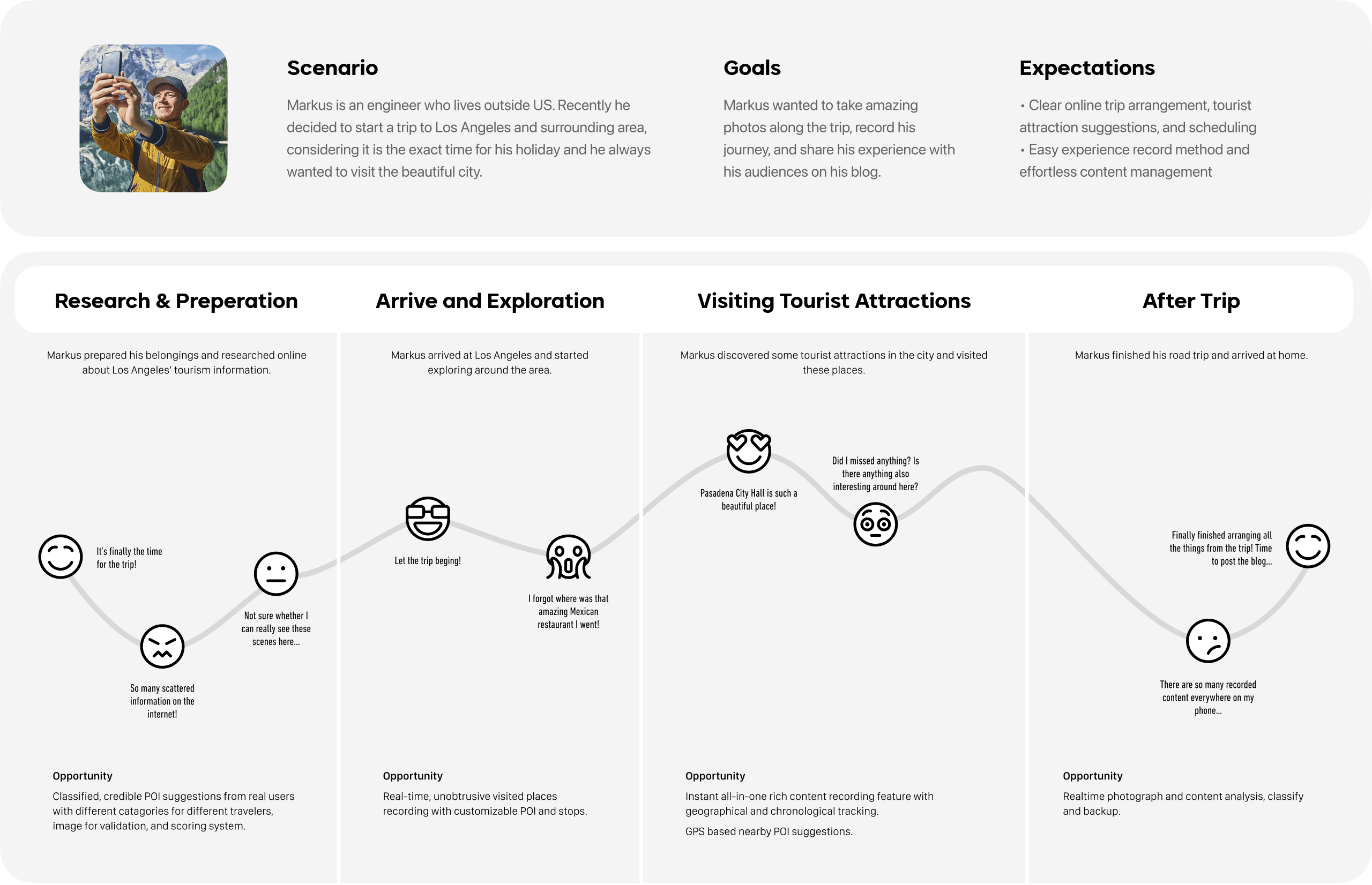
I first laid out a user journey for our personal Markus prior he uses the service. By separating the whole trip into four sections: research and preparations, arrival and exploration, visiting tourist attractions, and after trip. With the downfalling emotion clearly seen in the scenario, I then went further on how other competitive services perform these specific tasks.
What Can We Bring to the Market?
There are already similar services on the market that provide users with somewhat similar features. Hence, it is necessary for me to do more market research to make sure UBI can provide unique features that solve users' real problems in the mockup scenario and stand out from other competitive products.
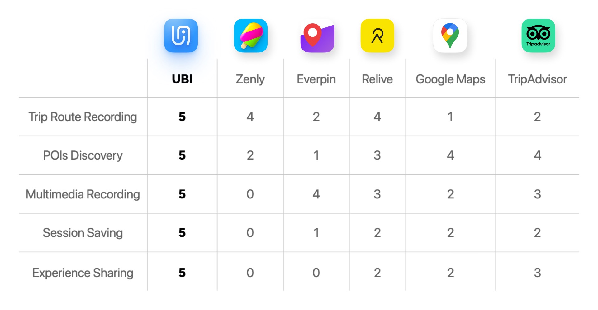
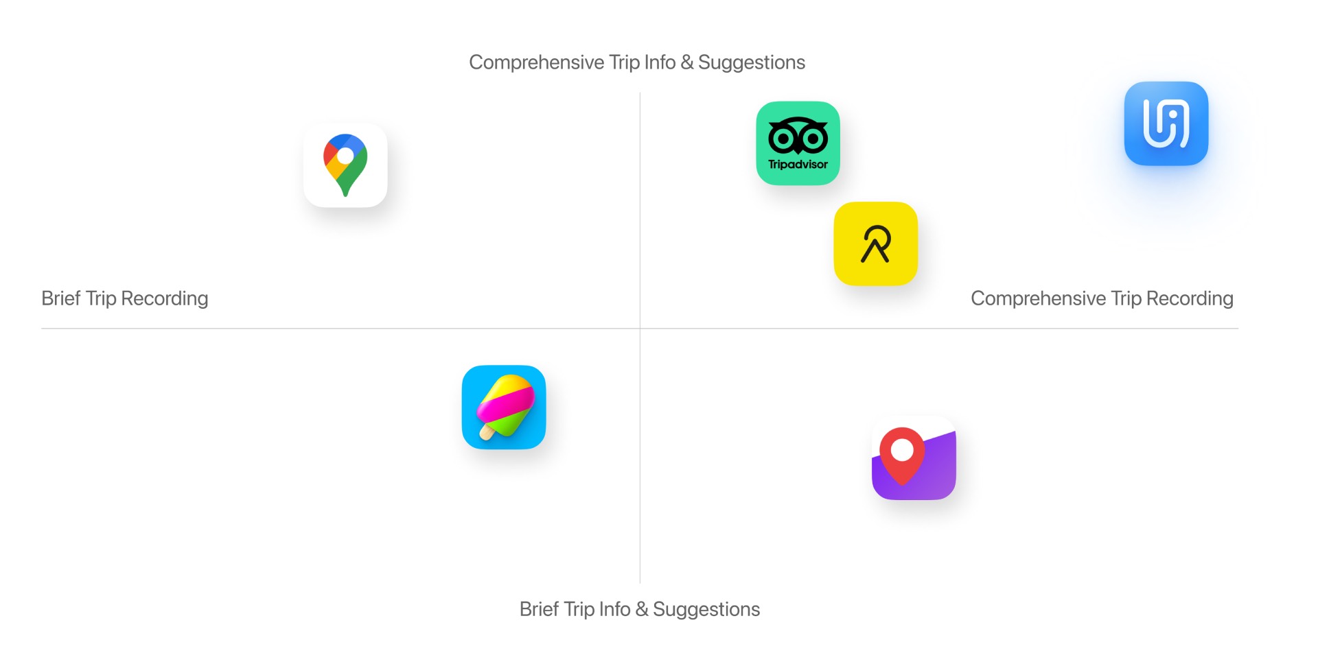
Market Research
Based on the previous mockup scenario, I chose several similar competitive products on the market, including Zenly, Google Maps, and TripAdvisor, to evaluate how they fit and perform in the scenario. With the scores in mind, I created a market matrix and positioned UBI in an area where it can perform more prevail than the fellow competitors.
Swipe to see more →
Signature Features
Every signature interaction is developed based on all the previous interviews and the user journey. They serve not only to solve the user's frustration points and elevate the user's experience but also to distinguish our service from the existing competitors as a better one on the market.
Signature Feature
Explore
Authentic travel / POI information and suggestions from real users.
Signature Feature
Record
Real-time or user-added travel route and point of interests recording.
Signature Feature
Sharing Trip
Co-create memories with friends together on a same trip.
Signature Feature
Memories
Record experiences through multiple formats and create unique memories.
User Journey After UBI
I also created a user journey after the user using the service. The user's frustration was drastically reduced by providing features including reliable traveling planning resources, intuitive and automatic route recording, and a intelligent memorizing and saving system.
Prototyping
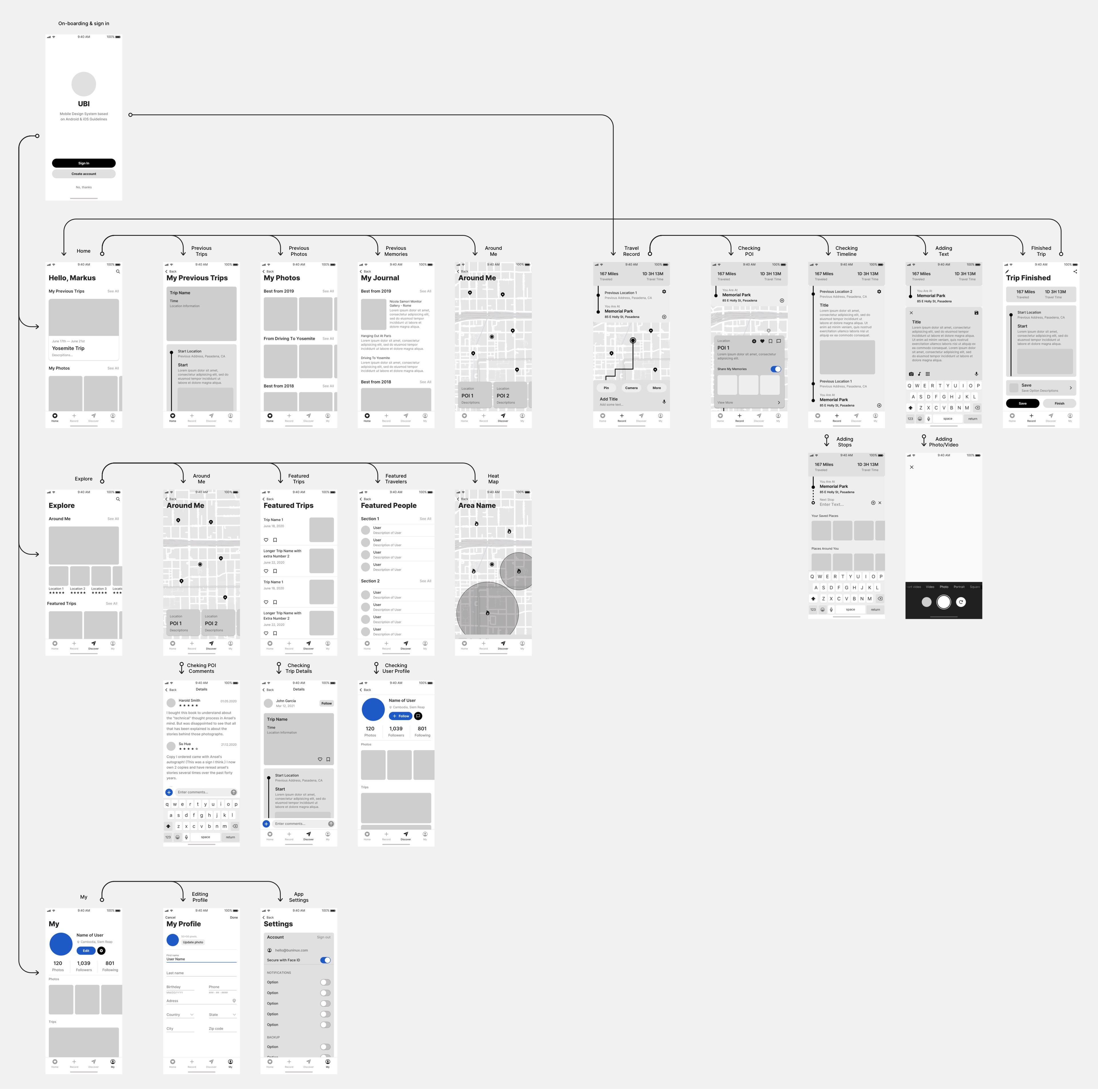
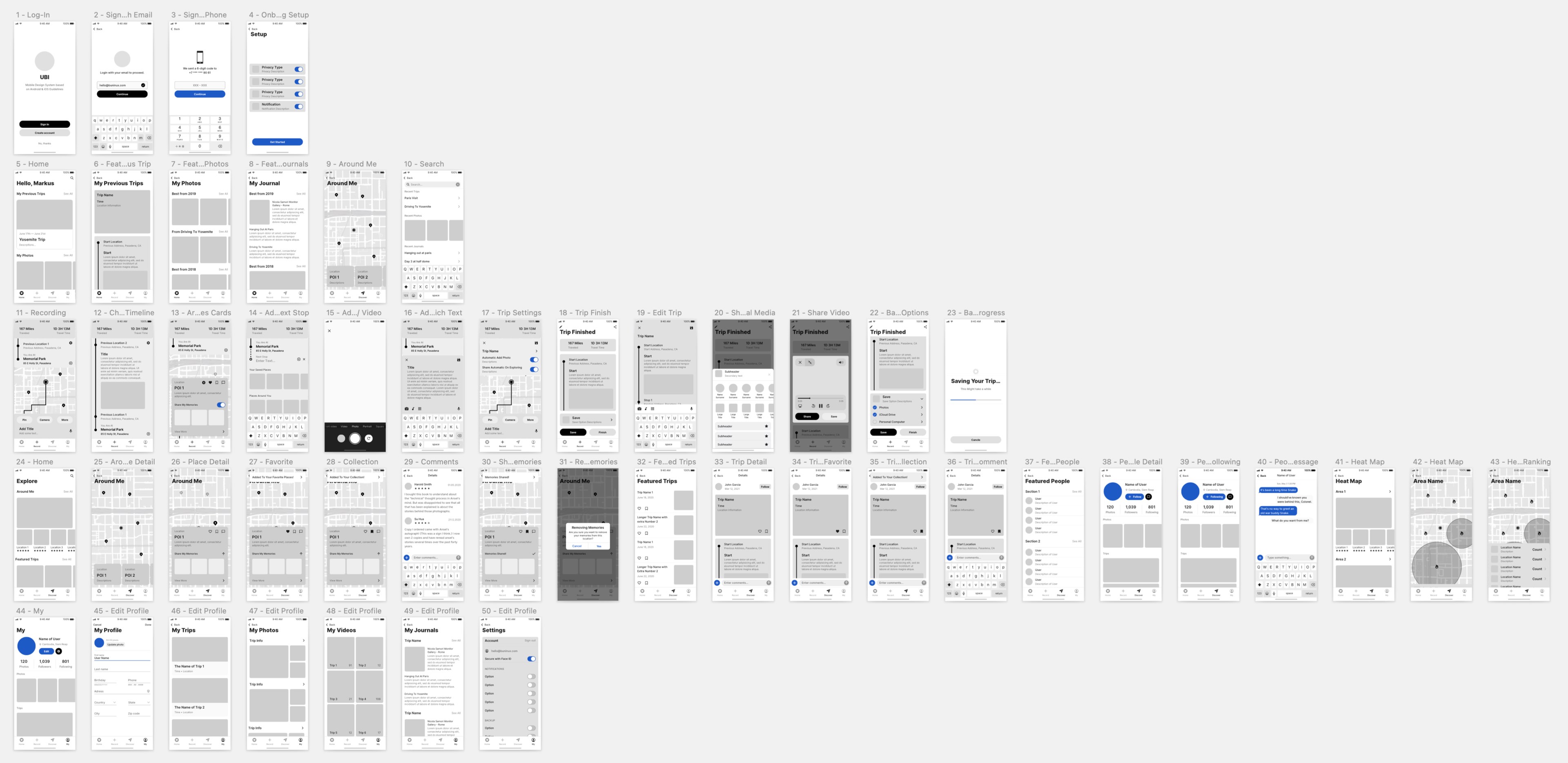
With the user scenario and signature interactions in mind, I created mid-fidelity prototypes to enhance further the detailed user interactions and screens in our services. The mid-fidelity prototypes not only act as an information architecture, which clears out the level of content in the design, but also gave us ideas about how many different user flows there might be in the mobile app.
Mid-fi User Flow
This mid-fi flow helped us clarify the four main sections users are going to face after logging-in the app: Home, Record, Explore and My. Each individual section also features different types of content and interactions.
Micro Interactions
I also created multiple micro-interaction flows for the signature features in the service. This is the micro-interaction flow for in-trip recording, one of the most important features in our service. With the help of the mid-fidelity prototypes, the micro-interactions between different parts on the page are sorted out easily, including the gestures required for the user to access certain features. These flows helped me built a solid foundation for the future high-fidelity interactive prototypes.
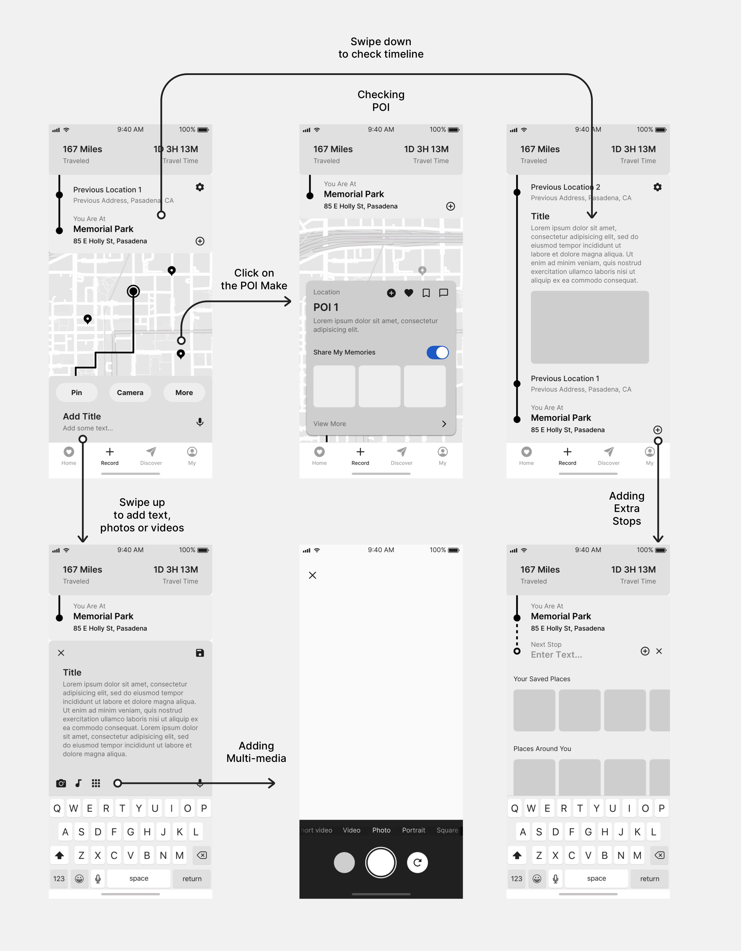
Final mid-fi prototype
Iteration and Testing
Before the final design of UBI, multiple rounds of design changes and user testing were made during the process. With the help of building the brand identity and testing users through different flows in the app, I was able to make a more throughout design at the end.
Design Iterations
During the process of brand identity making (which we will talk about later), multiple design iterations were made to explore different styles and colors. There are also numerous changes to the overall feature placements as the user testing took place. Eventually, I finally reached the state that the design system is consistent and scalable enough to be used in different scenarios.
Swipe to see more →
Final Iteration
3rd Iteration
2nd Iteration
1st Iteration
User Testing
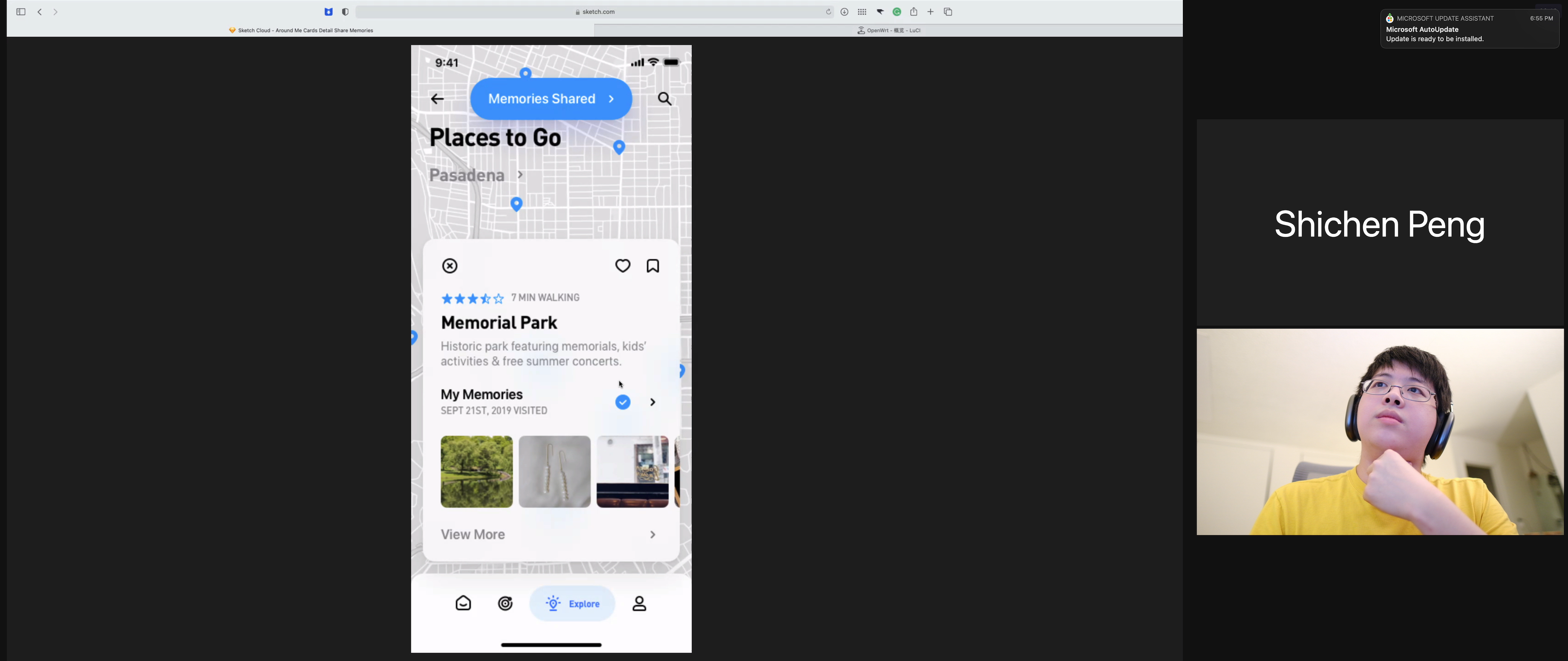
The online testing platform I used was Zoom and Figma / Sketch Cloud. Zoom provided an easy solution for direct communication and screen sharing, allowing the participant to point out the places they are confused with directly on the screen. Figma and Sketch Cloud were also helpful during the process. I was able to build up workable and straightforward prototypes quickly and reiterated them on cloud platforms, which allows the participant to interact without needing to download or install anything.
I led the user through multiple anticipated user flows during the online testing, including onboarding, POI discovering and researching, trip recording, and trip reviewing / saving. Through these flows, I was able to identify dozens of problems, from information architecture to minor UI issues. Some of the notable changes, including new user onboarding / discovery, multi-user trip sharing, and POI rating system, can be found in the final design.
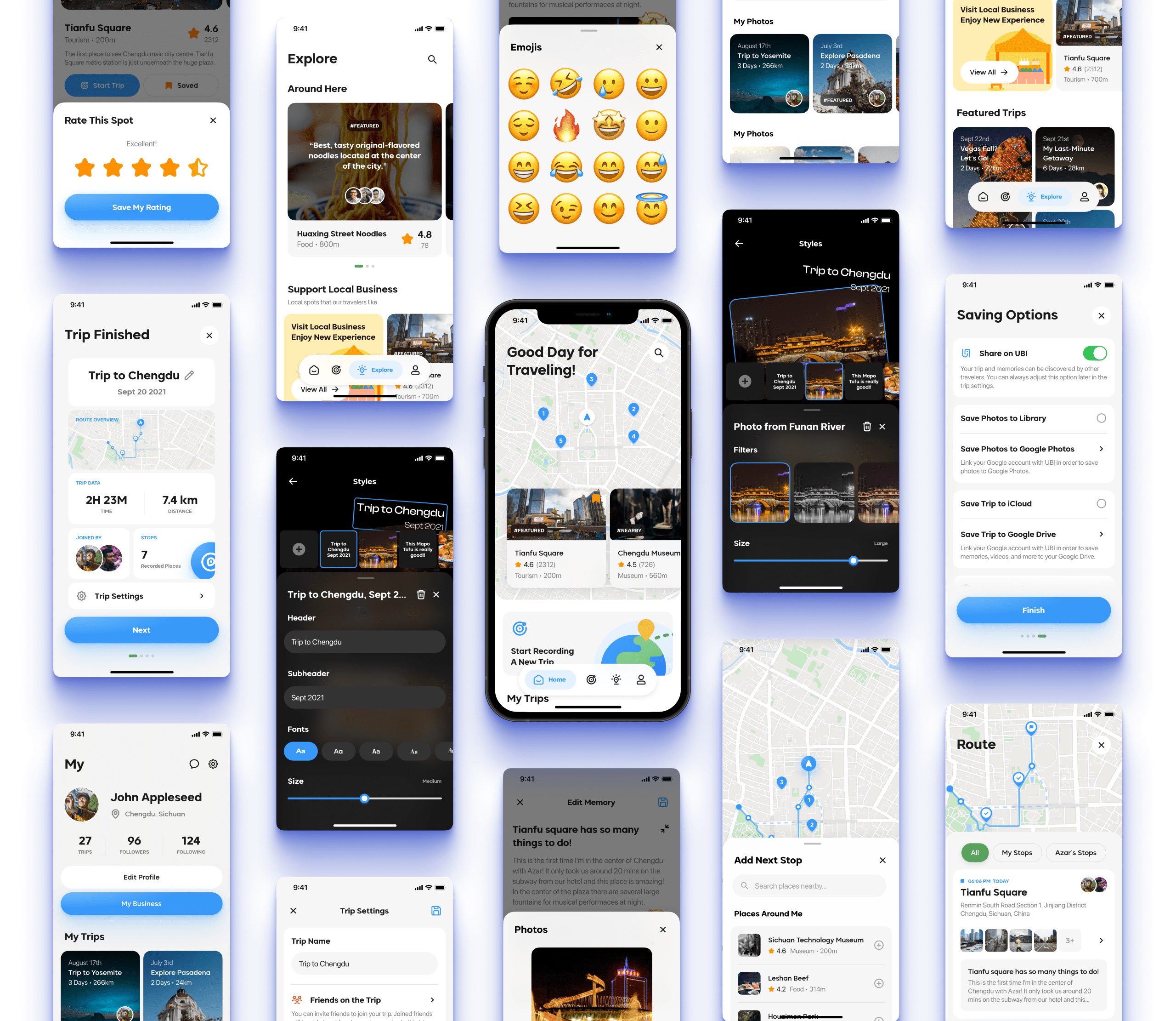
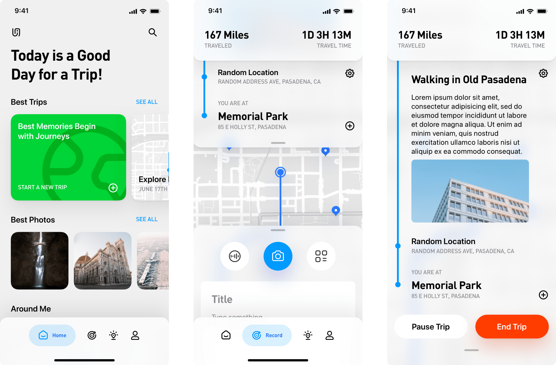
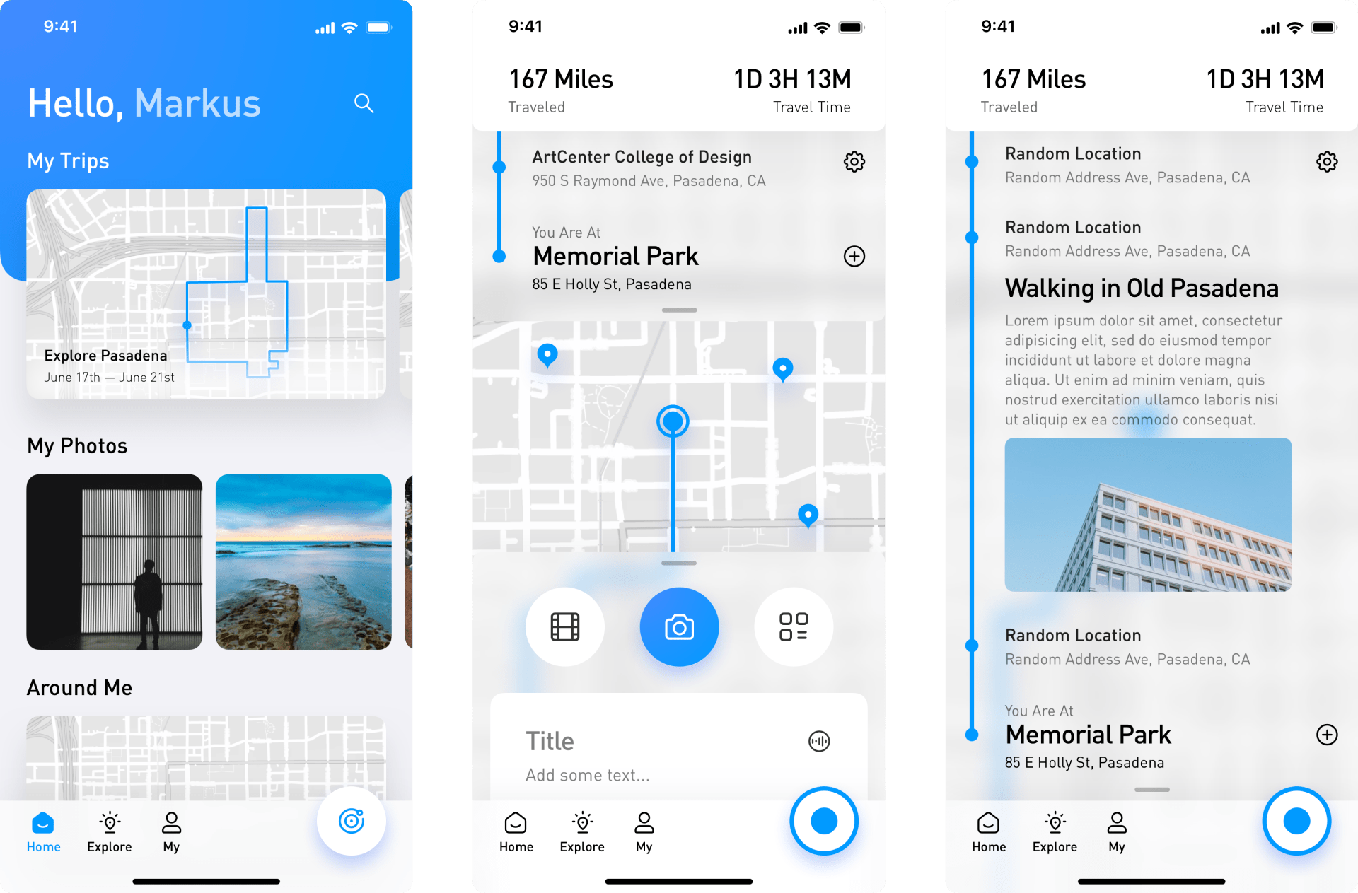
Final Design
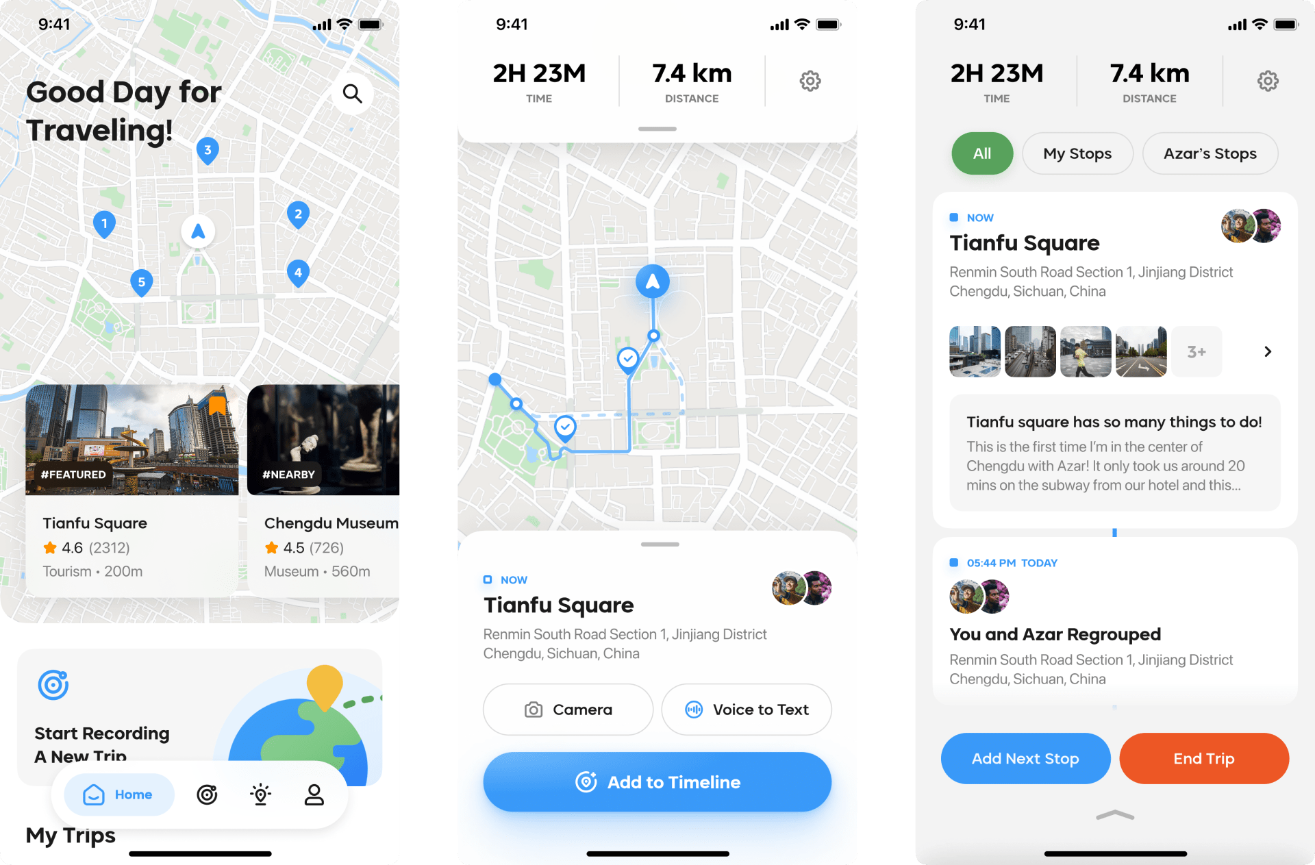
Main Feature
Explore
Discover new places around you. Rate them, save them, add them to your to-go list. Don’t know where to go? Check out other fellow travelers' memories, trips, and get excited about what’s coming in a new place.
Main Feature
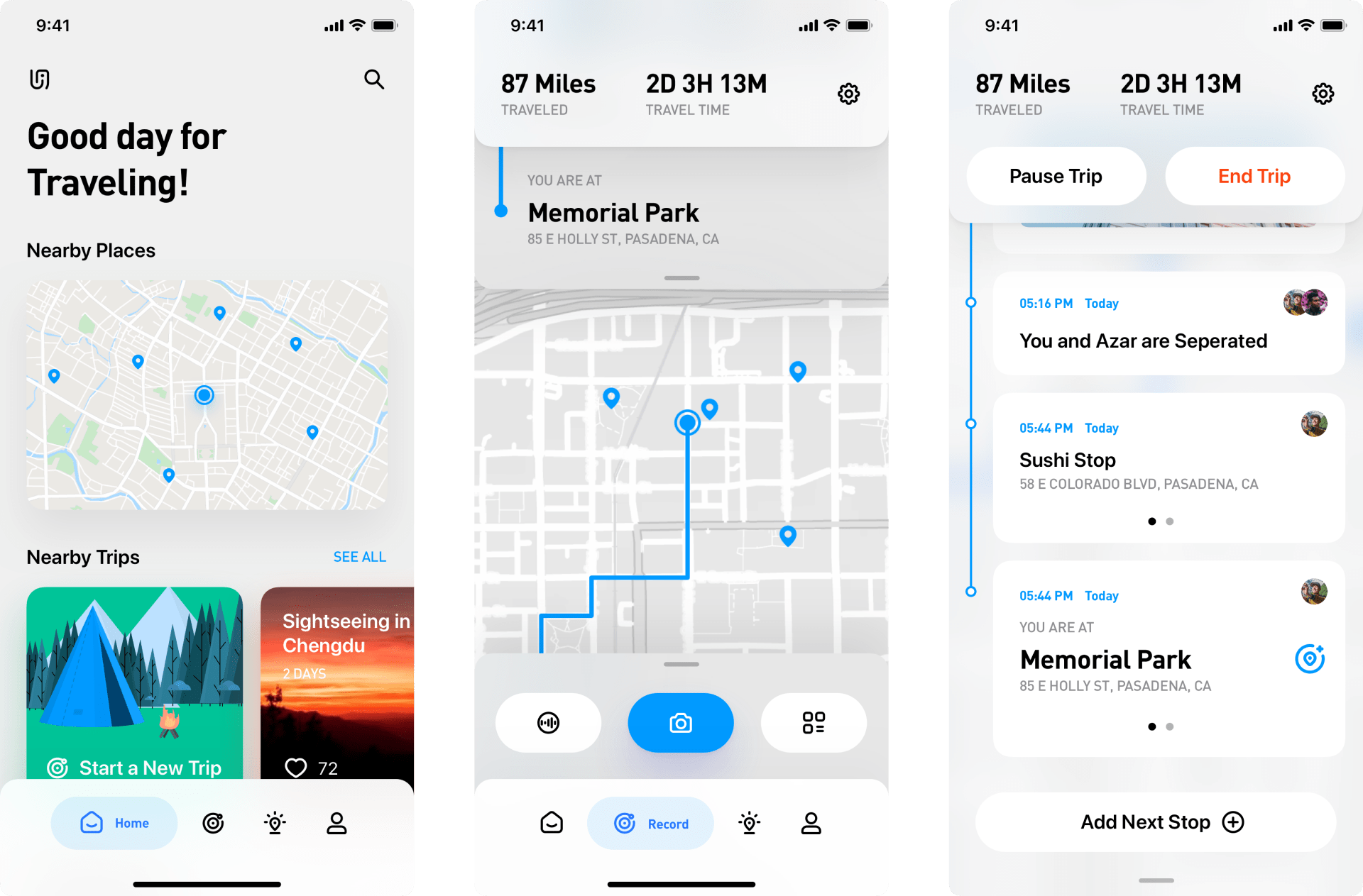
Trip Recording
Go to the Record tab, invite friends, choose your stops, and start recording when you are ready to travel! UBI will handle all the routes during the process, and all you need to do is add stops and create memories.
Main Feature
Memories
Create your unique memories using the memory tool, which supports photos, videos, voice, emojis, and more! You and your friend can share the same memory with content and texts from both of you.
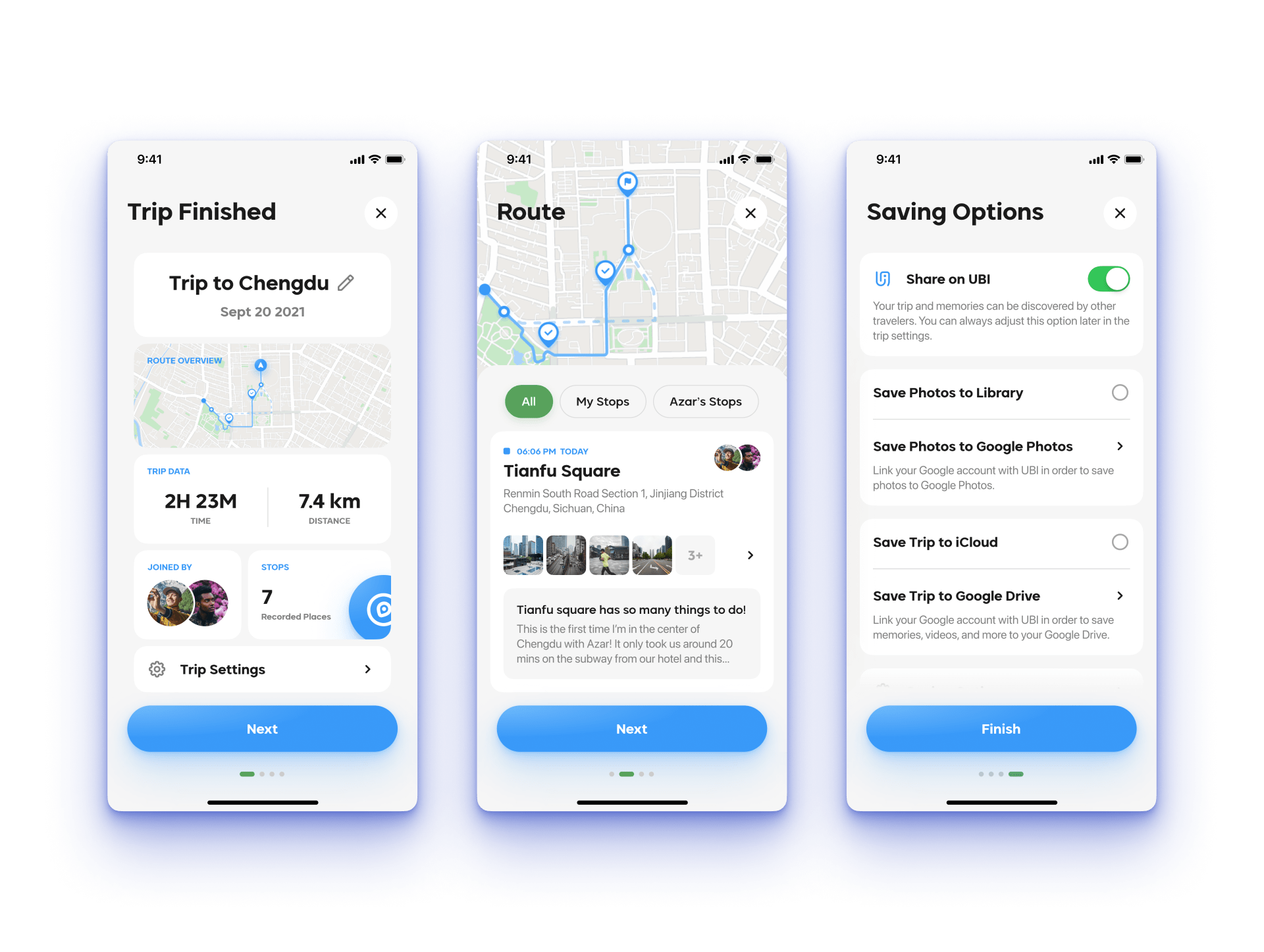
Main Feature
Trip Summary
After the trip, UBI will give you a comprehensive summary. You can check all of your previous stops and save your trip to different places, including photos to your photo library and organized memories to your cloud drives.
Main Feature
Customizable Memory Review
You can also check out the unique memories review video UBI created for you when you are at the trip summary. You can customize the content, filters, music, and more and share it with anyone you like.
Final Design
For Business Owners
UBI is also built to support local small businesses. Business owners can join the UBI promotion plan, track their stores’ performances, customize their storefronts with authentic data, and reach more customers with dedicated promotional sections in the app.
Branding and Visual Design
I also created a throughout brand guide UBI to further convey the fundamental thoughts of the service through both the brand value and the brand design. A visual design guide is also created for a consistent user interface design across the app and the strong connection with the brand itself.
Brand Design
The name UBI is inspired by the Latin word Ubique, which means everywhere. This name fits perfectly with our primary slogan, discover, record, share, which promotes the user to go different places and create shared beautiful memories. The logo of UBI is also inspired by the map's guiding and point of interest element and the UBI letters themselves. The color we used in the logo is a vibrant gradient from green to blue, which reminds people of earth and nature.
Brand Value & Principle
The brand value of UBI always around five main ideas: diverse, delightful, explorative, sharing, and natural, which are tied closely with our logo and naming. Based on these values, we also created and utilized our following principles during the design process.
Imperceptible
We prioritize the idea of providing intelligent and unobtrusive traveling experiences for users.
Authentic
We always provide authentic, non-promotional travel data from real travelers and memories.
Personal
Giving users the ability to create their own shared experience and worth-revisiting memories.
Market Presence
Marketing material is also crucial for a product's survivability, so I created a series of market presence materials like onboarding emails and occasional marketing emails to increase user retention over a long period, which includes yearly reviews and new trip recommendations.
Design System
For the design system, I chose Biotic as the leading brand font, considering its shape provides both playful and readable characteristics, and use the iOS default SF Pro fonts as the paragraph font. The color system is derived from the brand design with the same brightness for consistency. All the buttons, cards, icons, and forms are created systematically to maximize coherency throughout different screens.
Learnings & Next Steps
UBI has been the most ambitious personal project I have ever designed. It was a delightful experience testing out different design languages and ultimately designing a complete product from the ground up. Throughout the process, I found the following two points that I learned inspire me the most.
Practical Design System
Creating a practical and actual reasonable design system is hard. During the design process, I not only learned how to fully utilize design tools' component managing system, but also explored how to create a consistent design that adapts to different scenarios / content sizes while still being "developable". This gives me a clearer view of improving my future design projects.
Business Consideration
The profit stream and marketing materials are incredibly important to create a sustainable and successful business. During the process of making UBI, I had the opportunity to think of the other side of the product, the related supporting small businesses, and design for them. Such consideration widened my thinking process, and I hope I can utilize such a mindset more.
What's Next?
The original idea of UBI has always been in my mind, and I would love to develop this project even further. I recently talked with my friend Jason, a fantastic developer and engineer (while also being the user-testing participant in this project), about this project's future. We agreed that we would love to bring this project to life using newborn technology like SwiftUI together.
I'll keep this page updated if new things come up, and let's hope that one day we can see UBI on the App Store or somewhere else ;)